Deconstructing the Infographic Diagrams
February 12, 2016

If you use our Infographics, Toolbox for Keynote, Toolbox for iWork, or Toolbox for MS Office apps, you might be familiar with the behemoth that is Diagrams. This massive set contains over 1,000 slides at the moment, and we have no intentions to stop expanding it. Considering this huge range, we thought we could provide you with some more guidance over the types of diagrams available and the best ways to make them work for you.
The 1,050 designs currently on sale are displayed alphabetically, starting with data diagrams and going down all the way to timelines. It’s getting overwhelming now, so we are working on more advanced ways to browse the huge collection but the current setup is pretty basic. Each design consists of a single Keynote slide with one or more custom diagrams and possibly other elements to complete the layout.
When you open the set, Data Diagrams are the first ones you see. This category contains traditional Keynote/PowerPoint charts in different styles as well as other ways to lay out numbers or facts. These include shape-based text boxes and illustrations explaining the structure or features of items and concepts. You can use them to highlight the key figures of your presentations or support your statements with numerical data.
Fraction Diagrams form a subset of Data Diagrams and focus on dividing objects into smaller segments and demonstrating proportions. Again, there are a few standard-type charts included, but most slides feature shape-based diagrams to illustrate concepts like rating (e.g. 3/5 stars) or the charging level of a battery.
Flowcharts are all about counting steps and laying them out in a myriad of ways. They can go from left to right, form a ladder, twist and turn into a winding road, or just go in round cycles. This category is related to Lists and Relationship Charts. Lists are also based on numbering but pay less attention to the direction of the steps. Relationship Charts place less emphasis on numbering but illustrate ways in which items are related, demonstrating structures, networks, and cycles. All of these can be used to provide a logical sequence and order to whatever you are presenting.
Icon Diagrams are the pretty ones, mostly ignoring data and structure in favor of images. You can used them for visual impact and, as they’re based on standard Keynote/PowerPoint shapes, edit and rearrange them in any way you find convenient. Image Diagrams are similar but feature media placeholders, where you can drag and drop your own photos.
Silhouette Charts can illustrate numbers, fractions, structure, or other concepts, only they do it with the help of stickman (and stick-woman) shapes. If you want to be crystal clear that your data concerns people, that’s the way to do it.
The three remaining categories are pretty self explanatory: Maps consist of, well, maps; Schedules are displayed as tables, lists, or more fancy layouts; and Timelines are a lot like Schedules but put more focus on the linear structure.
So that’s it for now. We hope it’s easier to understand the different types of the diagrams now, and we’re back to working on a more convenient way to find the one specific diagram you’re always looking for.
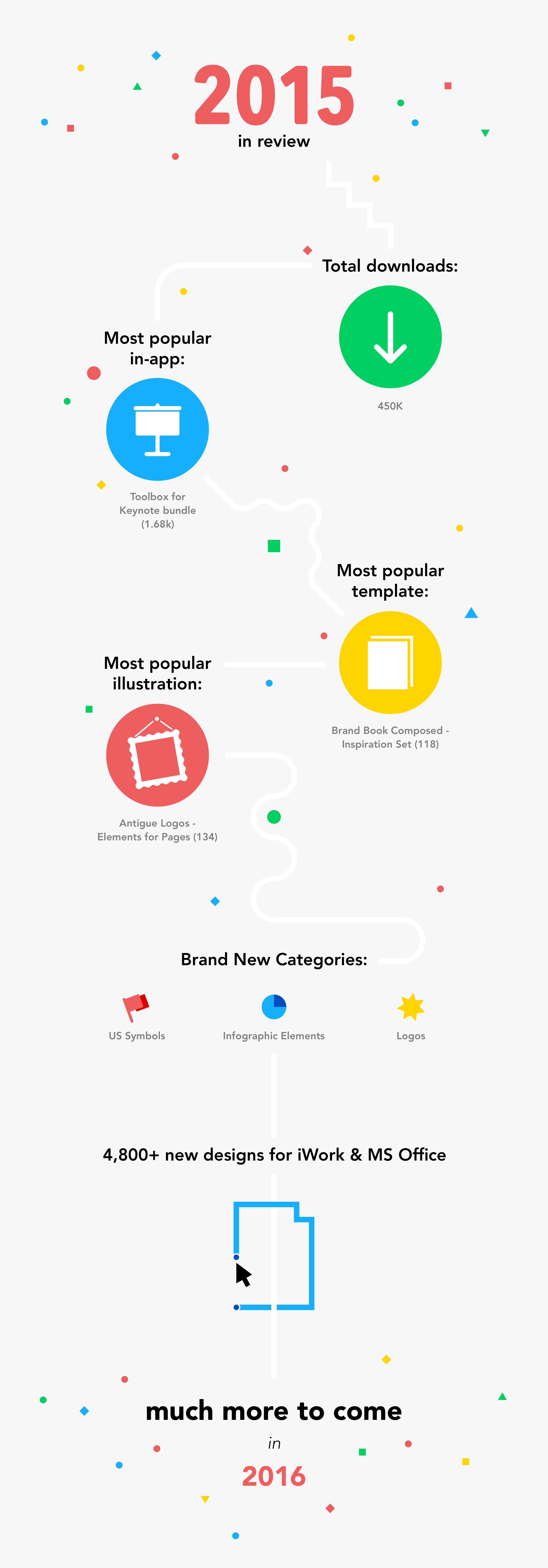
Early Christmas Present
December 14, 2015

As Christmas approaches, let’s see if we can help you save at least some of the inevitable stress. Among hundreds of other designs, the latest update of Toolbox for Pages brings 10 beautiful, free greeting card templates to cheer up your loved ones. Bring on the jingles!
Whether or not you have previously purchased Inspiration Set, you can access the free greeting cards in the New and Purchased sections of Toolbox for Pages.
May happiness and harmony be with you this holiday season and throughout the coming new year!
Introducing Infographic Elements
November 30, 2015
Infographics is one of our most popular products, both as a standalone app and a part of Toolbox for Keynote. That’s why many of you will be happy to see a newly introduced category of Infographics, Infographic Elements. The first batch contains 31 sets of designs to make your Keynote presentations extra special.
The new infographic elements are related to the data visualization designs, which have been a part of Infographics ever since the app first came out. However, the data visualization sets have ready-made layouts with specific topics that link all included diagrams together. The infographic elements are a lot more flexible and can be used in a variety of different layouts and situations. They allow you to take bits and pieces from several sets and combine them in ways that are unique to you.
You can find full-size previews of Infographic Elements in the Infographics section of Toolbox for Keynote. The standalone Infographics app is also available on the Mac App Store.